
Article
How to build a custom design system in Flutter 2026

This updates our 2025 guide, Building and maintaining high-quality Flutter UIs with a custom design system, which was written for Widgetbook 3 in the pre-AI era. In the following, you will learn how to build and maintain your own custom widget catalog and design system by using Widgetbook.
Now is the best time to build your custom design system
Flutter moves material and cupertino out of the framework
On August 12, 2026, Flutter 3.47 shipped, moving material_ui and cupertino_ui out of the SDK as standalone 1.0 packages, with formal deprecation of the bundled libraries due in November. Emma Twersky writes in the Flutter 3.47 announcement, “We lay the groundwork for a style-neutral Flutter core widget catalog, making it easier to build custom design systems in the future.”
A design system is crucial for agentic engineering
Ask an agent to build a screen and you get something that compiles in seconds. Whether it matches your product is a different question, and the answer depends almost entirely on what the agent could read before it started.
A design system collapses the search space. Without one, the agent picks from all of Flutter plus everything it saw in training. With a design system, it picks from your components. That is the difference between ElevatedButton and AppButton, and between Color(0xFFFF0000) and a token that resolves per theme.
It is a typed contract, not documentation. Widgetbook 4 generates an _Args class from your widget’s constructor, so the agent reads the exact parameters and their types instead of opening the widget source and guessing.
It is a set of worked examples. Your existing stories show which states actually exist in this codebase: pending, expired, error, empty, loading. No prompt conveys that, and no API reference contains it.
It makes correctness checkable. With tokens and lint rules, a hardcoded hex is an analyzer warning. With scenarios, a wrong state is a failed assertion anchored to a name. With accessibility guidelines, a 32×32 button is a violation, and the message Expected at least 48×48, found 32×32. Without any of that, “does this look right” is a judgment call that only a human can make, which means there is no loop for an agent to close. Tokens and stories are what turn taste into a test.
One artifact serves both audiences. What lets a designer review a pull request without running the app is the same thing that lets an agent verify its own output. You are not building agent tooling on the side. You are building a design system, and the agent loop comes with it.
Agents did not reduce the value of a design system. They raised it. Generating UI now costs close to nothing, so the bottleneck moved to verification, and a design system is what makes verification cheap.
Who this guide is for
Product and engineering teams past the prototype stage, building one or several apps, who need to deliver a consistent experience, onboard people quickly, cut UI bugs, and scale UI work across teams. If you are shipping an MVP next week, skip this and come back later.
Start in Figma
The system starts with your design team, and Figma is still the place where most designs are created. If you’re not using Figma and design straight in code, just skip this section.
Figma’s free design systems course is about two hours. If you do not have two hours, the four things worth taking from it are:
Design system is more than a UI kit and includes process, governance, and documentation.
A Design System is a reusable resource that speeds up product work rather than a style guide
The decisions about tokens, naming, component scope, and versioning affect engineering roadmaps, so engineers belong in them early.
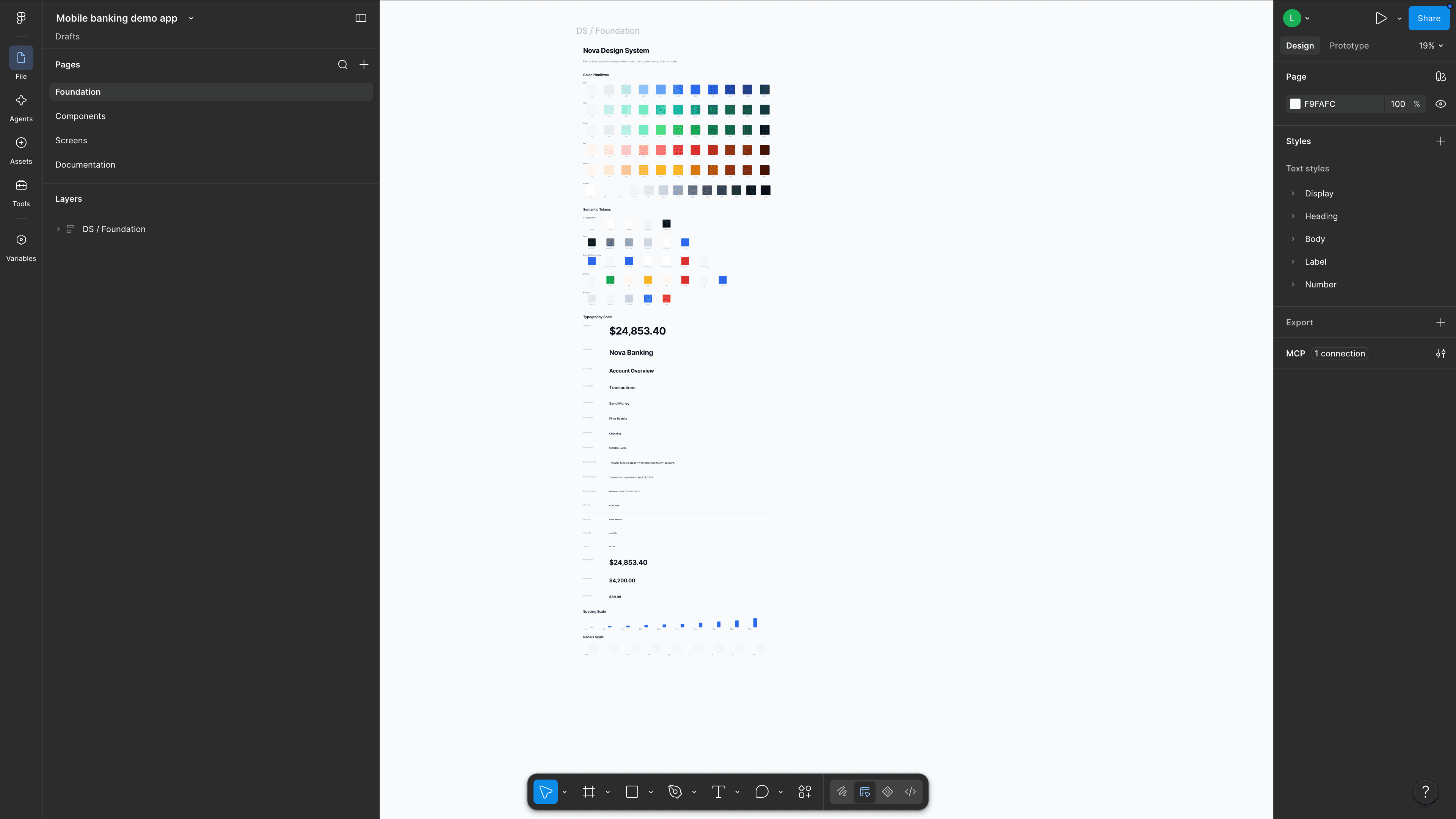
For handoff, Dev Mode’s Ready for Dev view collects every frame marked ready across a file into one list, tracks what changed since it was marked, and offers a compare view so an update does not slip past you.
Design-to-code with the Figma MCP server
The biggest change to handoff since our 2025 guide is Figma’s MCP server, which turns Figma into a context source for coding agents. Instead of pasting a screenshot and hoping the model infers your spacing, the agent reads the node tree, the variables, and the component metadata.
The two tools that matter:
get_design_contextreturns a structured representation of the selected frame: layers, layout, hierarchy, content. This replaces the screenshot as the source of truth.get_variable_defsextracts the variables and styles in the selection (color, spacing, typography, radius). This is what lets the agent emit a token reference instead of an inlined hex value.
There is a remote server at https://mcp.figma.com/mcp, which is what most teams should use, and a desktop server at http://127.0.0.1:3845/mcp for setups that need it. Access comes with Dev or Full seats on paid plans.
Bake accessibility in here, not later
Accessibility is cheapest at the token stage and most expensive at the audit stage.
It also stopped being optional for some teams. The European Accessibility Act has been applicable since 28 June 2025. It does not cover every app, but it covers e-commerce, consumer banking, e-books, passenger transport, and telecommunications. Conformance is demonstrated against EN 301 549, which incorporates WCAG at Level AA. Beyond compliance, the WHO estimates 1.3 billion people, about 16% of the world, live with a significant disability, and Q42’s analysis of 1.5 million iOS users found a third of them change their device text size. That is roughly one user in five running your UI at a text scale you probably do not test.
What to encode at design time:
Contrast ratios that already meet AA, so no component can be built out of a failing pair.
Minimum target sizes in the component API, so a 32×32 button is not expressible.
Text scale headroom in layouts, so 200% does not overflow.
Annotated reading order and heading levels in Figma, since no automated tool infers intent.
Figma’s accessibility guide covers the design-side practice.
Organize the design system in code
Where the design system lives depends on how many apps consume it.
Single app. A local package inside the repo. Keep it a separate package rather than a folder, so the dependency direction stays one-way and stays enforceable.
Multiple apps, separate repos. A dedicated package repository, imported via pubspec.yaml. You pay for this in version management.
Monorepo. The common choice for teams running several Flutter apps. The design system is a package in the same repository, referenced by relative path. You get atomic changes across the system and its consumers in one commit, no intermediate publishing, and a single CI pipeline that catches a breaking change in every downstream app before it merges.
Salto runs seven production Flutter apps with one shared Widgetbook for common components and seven app-specific ones for each app’s own widgets and screens (read case study). That split is worth copying: shared components get reviewed as a system, app widgets stay close to their app, and both are catalogued.
This demo uses the simplest useful version of that layout, an app package with a sibling Widgetbook package:
Story files never live in the app’s lib/. The app does not depend on Widgetbook. Widgetbook depends on the app.
Build the style foundation
Tokens are the abstract values the whole system resolves against. Mature systems layer them.
Primitive tokens name raw values. blue600 is #2563EB. No meaning, just a memorable handle.
Semantic tokens give primitives a job. interactivePrimary is the fill of a primary action, and it points at a different primitive per theme. This is the layer your widgets read.
Component tokens are per-component aliases. Useful in large systems where you want to restructure without touching every component. This demo stops at semantic, which is the right call until you feel the pain.
Spacing and radius follow the same idea and are simple constants:
Keep the scale small and snap odd values to the nearest token. A bespoke 6 or 22 reintroduces exactly the drift the scale exists to prevent.
Two ways to carry the theme
For semantic tokens you need something that resolves per theme and is reachable from any BuildContext. There are two reasonable choices.
| Custom | |
|---|---|---|
Setup | Register on | Your own widget and |
Access |
|
|
Theme transitions | Interpolated via | You implement it |
Works with Material widgets | Yes, same | Only if you also supply a |
Widgetbook addon |
|
|
Coupling to Material | Ties you to | None |
Take ThemeExtension if you use Material widgets anywhere, which is most teams but might change now with Flutter 3.47. You inherit theme animation and every Material widget keeps working. This is what 1KOMMA5º chose for Harmonized even though it is not built on Material, for the theme transitions and the access pattern their developers already knew (read case study).
Take a custom InheritedWidget if your design system is genuinely standalone and you want no dependency on ThemeData at all. Given the 3.47 decoupling, this position is more defensible than it was a year ago, and it is the shape our 2025 guide used:
The demo uses the ThemeExtension path. The semantic scheme is a ThemeExtension mirroring the Light and Dark modes of the Figma Colors collection:
Both themes come out of one pipeline so they cannot drift:
Widgets read semantic tokens through a context.colors extension, never the primitives:
1KOMMA5º generates this layer instead of writing it. They export Figma tokens as JSON and convert them to Dart with a custom build_runner, so a token change in Figma propagates with almost no manual work (read case study). That is the right end state, and it is worth doing once your token set stops changing shape every week.
Tokens are your cheapest accessibility control
Across this demo’s 54 captured scenarios, the contrast guideline flags 5 text elements. They sit in Input, Button, and Sign In, and most are disabled states, which WCAG 1.4.3 actually exempts, so treat this rule as advisory rather than a verdict. None of them are in PaymentRequestRow, a component dense with secondary text. It passes because the masked card line uses colors.textSecondary, a token that is already AA in both themes, instead of a hand-picked grey.
The design system prevented the bug rather than detecting it. Fix contrast and minimum target size in tokens and component APIs, and whole categories of violation stop being expressible. That is worth more than any rule that catches them afterwards.
Component architecture
Break components down systematically. Most teams use some version of atomic design.
Atoms:
AppButton,AppTextField,AppAvatarMolecules:
QuickActionButton,AppTransactionTileOrganisms:
BalanceCard,BankCard,PaymentRequestRowScreens:
HomeScreen,SignInScreen
Catalog the screens too, not just the leaves. This is the step teams skip and regret. A component can look correct in isolation and break a screen in a specific state, and screens are where text scale and narrow devices actually bite.
1KOMMA5º catalogs every app-specific widget and screen, not just the design system. Their reason is practical:
Thereby, we can easily showcase specific edge cases of our app. Sometimes, even for QA, it’s super hard to create and test certain edge cases. It’s way easier to just send them the link to Widgetbook.
- Anton Borries, Senior Software Engineer at 1KOMMA5º, Google Developer Expert for Flutter and Dart
Also, Caza de Casa builds every new page in Widgetbook, and their founder measured it at roughly an hour saved per day.
Catalog the components with Widgetbook 4
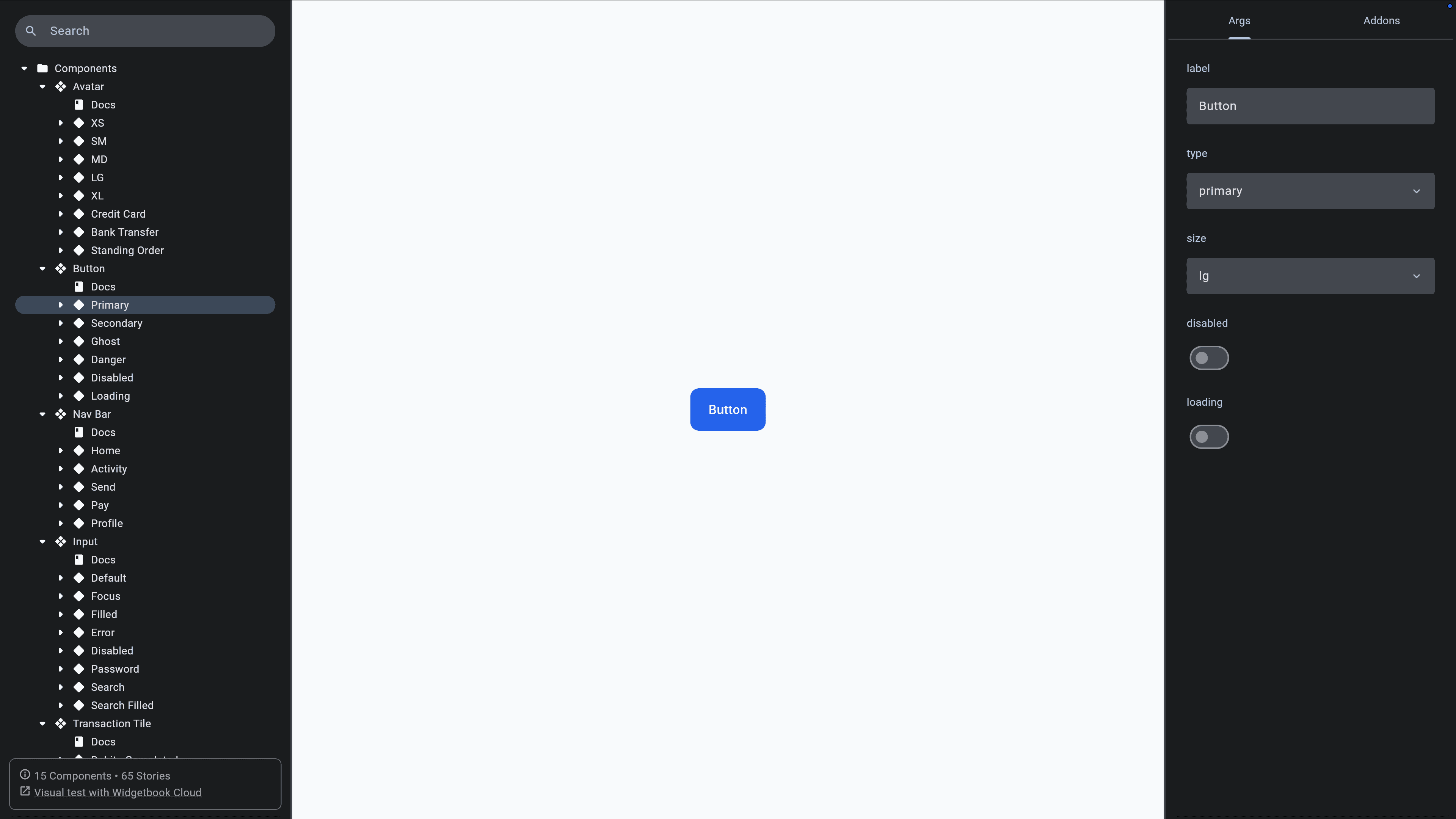
Widgetbook is an open-source Flutter package for building, cataloging, and testing widgets. Version 4 replaces v3’s function-heavy setup with a generated, typed API.
If you are coming from v3, the vocabulary changed:
v3 | v4 |
|---|---|
Use-case ( | Story ( |
Knob ( | Arg ( |
Addons only | Addons plus Modes |
Hand-written setup | Generated |
And here is how the vocabulary lines up with Figma:
Figma | Widgetbook 4 |
|---|---|
Component | Component, declared by |
Variant | Story |
Component property | Arg |
Variable | Theme data |
Variable mode | Mode |
Variable collection mode set |
|
Speaking the same words as your designers is not a cosmetic win. It is what makes a design review a conversation instead of a translation exercise.
A story file
A story file sits in the Widgetbook package, mirroring the widget’s path. It declares the component, the widget, and one story per meaningful state.
Story variables start with $, and the name minus the $ becomes the display name. Every story file needs its part directive. Meta must be const.
Args are generated from the constructor, so they are typed:
_Args(...) produces interactive controls in the running catalog. _Args.fixed(...) takes raw values and is what scenarios use, because a test needs a fixed input, not a knob.
When a constructor takes callbacks, derive args from a small input class instead and map them once:
Use this only when the constructor genuinely does not fit. Without argsType, the generator writes the builder for you, which is one less thing to get wrong.
Wiring your theme in
Register the theme as an addon so every story can be viewed in either mode. With the ThemeExtension approach that is MaterialThemeAddon:
With a custom InheritedWidget you use the generic addon and supply the builder:
The components list is generated. Every *.stories.dart in the package is collected into components.g.dart by build_runner, so adding a story file is all it takes to catalog a component.
Catalog the tokens too
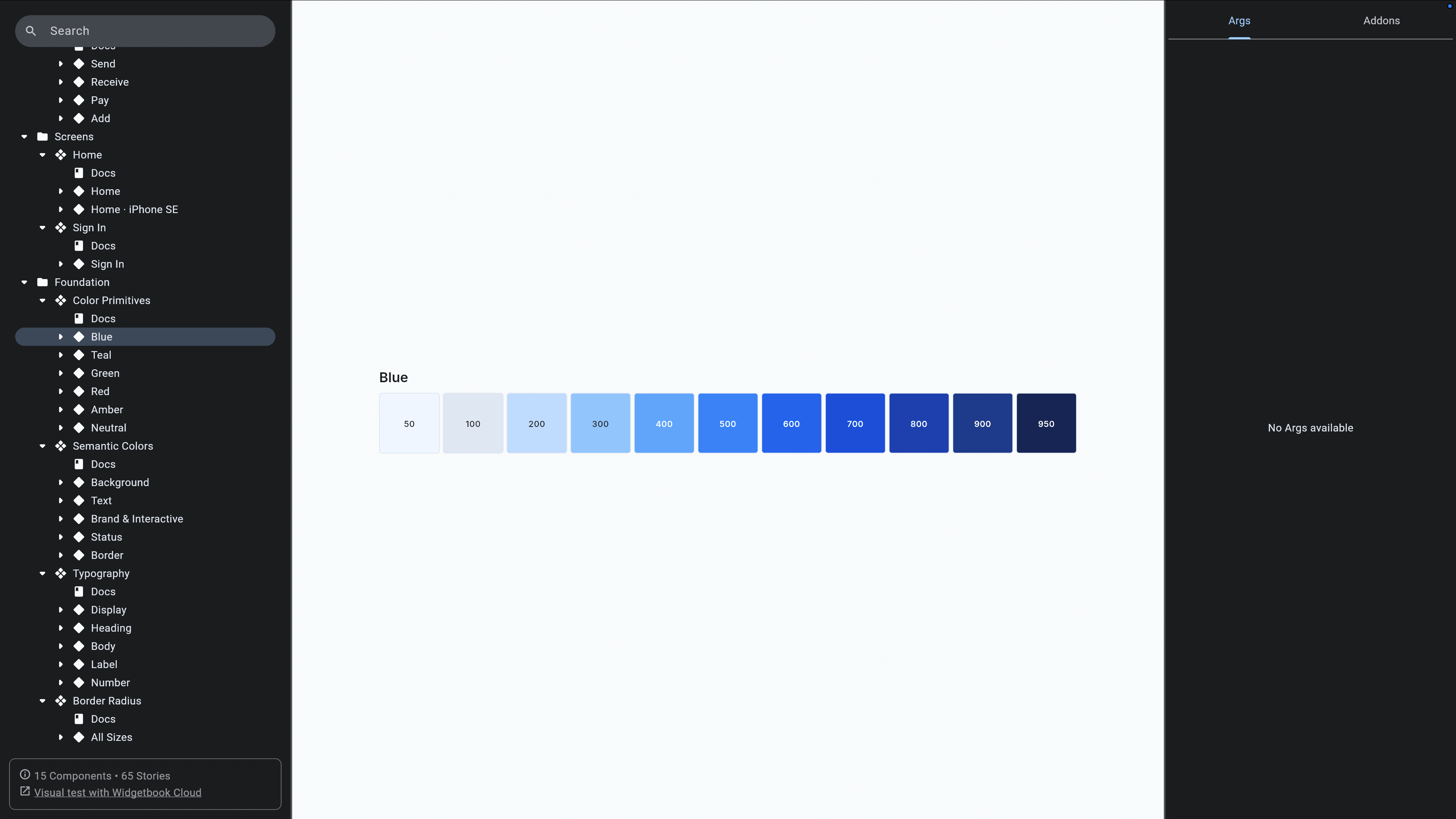
The style foundation deserves entries of its own. This demo has components rendering the color primitives, the semantic scheme, the type scale, and the radius scale, so a designer can check the implemented values against Figma without reading Dart.
Document how it should be used
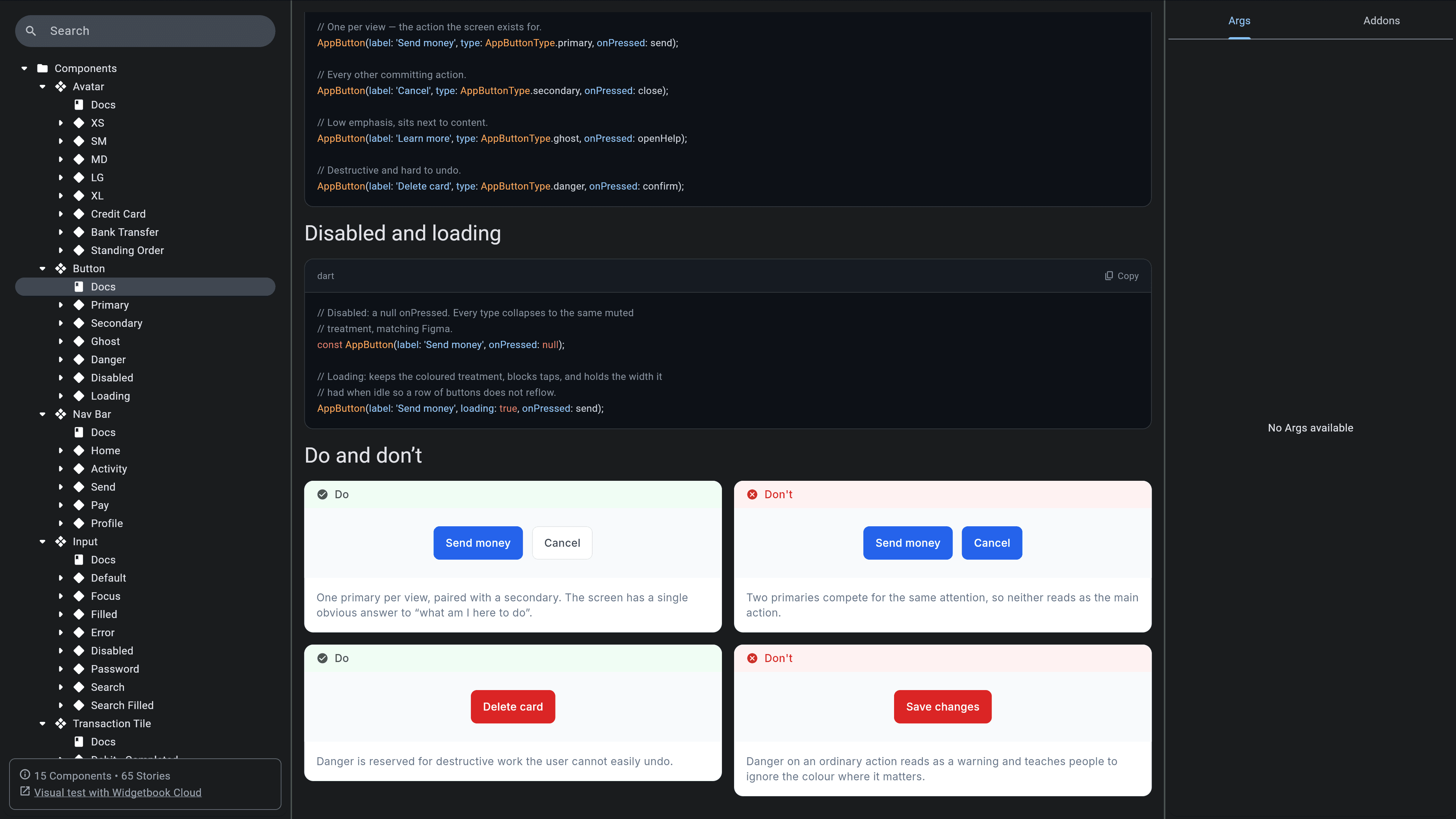
A story shows what a component looks like. It does not say when to reach for it, and that is what a new developer and an agent both get wrong.
Widgetbook 4 renders a documentation page per component, and it is on by default. `Config.docsBuilder` starts as three blocks:
`DartCommentDocBlock` renders the Dart doc comment on your widget class, extracted from source during generation. So the usage rules go where the code is:
Write the constraints the type signature cannot carry. `AppButtonType.primary` tells you the value exists; only prose tells you one primary button per screen. Document what a reviewer would otherwise leave a comment about.
That comment then has one source and four readers: hover in the IDE, dartdoc output, the Widgetbook page a designer opens, and the agent reading the widget file before it generates anything. A wiki page is a second copy that starts drifting the day it is written.
To compose the page differently, override it per component. `ComponentMeta.docsBuilder` receives the global list and returns a new one, with `insertAfter<T>`, `insertBefore<T>`, and `replaceFirst<T>` for editing it in place:
Make the design system readable by agents
Everything so far also happens to be the context an agent needs. Three things make it usable.
Write a skill
A skill is a plain text file the agent loads at the start of a session. It teaches the story API, your conventions, and the workflow, so the agent does not rediscover your rules every time. This demo has one at .claude/skills/widgetbook-v4/, split into a working set and reference files loaded on demand.
The rules worth writing down are the ones no prompt conveys: where story files live, that design system widgets are mandatory, that tokens are mandatory, which components exist, and what “done” means. From ours:
The Widgetbook workspace is its own Flutter package that lives outside the app’s
lib, as a siblingwidgetbook/folder. Never put Widgetbook or*.stories.dartinsidelib.
Point it at your stories
With the skill loaded, the agent reads existing stories before writing anything. This is plain file access, no tooling:
From those files, it reconstructs the design system. Meta(AppButton.new) tells it AppButton exists and where. The generated _Args gives it every parameter and type without opening the widget. The scenarios list shows which states this codebase actually cares about. Mode definitions show which theme, locale, and viewport combinations are legitimate.
This is why the generated Widgetbook 4 API matters for agentic work specifically. It is explicit, typed, and identical across every widget, which is exactly what makes it machine-readable.
One operational note: run the generator in watch mode. _Story, _Args, and _Scenario only exist after generation, and an agent writing against missing types produces code that does not compile and then guesses at fixes.
Back it with lint rules
A design system is only real if it is enforced. Custom lint rules turn “please use the design system” into an analyzer warning the agent is told to clear. This demo ships four rules in a local nova_lints package. Running them against a file with the classic agent mistakes:
Note that the third message names the replacement. Use AppButton instead of the raw ElevatedButton is a fix instruction. A generic “do not use raw Material widgets” is not. Write the message for the reader who has to act on it, whether that reader is a person or an agent.
The instruction in AGENTS.md or CLAUDE.md is then one line: use design system components when building UI, and clear all analyzer warnings.
Build these with `custom_lint` or use DCM if you would rather not maintain them.
The local feedback loop
Everything above is prevention. This is the part that catches what prevention missed, and it is one command. We go deeper in our agentic UI engineering guide.
Scenarios
A scenario is a fixed, testable state of a widget. Values are hard-coded on purpose, because a test needs determinism, not a knob.
For behavior, run gives you a WidgetTester and the full flutter_test API:
The screenshot is captured after run completes, so you control the moment of capture. For animations, pump a specific duration to snapshot a mid-animation frame.
The mode matrix
Writing every theme and device combination by hand does not scale. Define them once in the config and they cross with every scenario:
ScenarioStrategy.perScenario, the default, crosses the definition with every local scenario. Use it for dimensions every state should be tested in, like themes. perStory produces one snapshot per story instead, which is right for viewports where one render per story is enough.
Adding the two theme definitions to this demo’s component suite takes it from 58 test cases to 101, and you can see the crossing in the names:
Static has no local scenarios, so it gets one snapshot per definition. Everything else is crossed.
Running it
One entry point, one command:
The config you hand testWidgetbook needs an appBuilder suited to capture, and that is usually not the one your running catalog uses. Capture works by walking up from the pumped story to the nearest repaint boundary, so an appBuilder that wraps everything in a MaterialApp and Scaffold fills the whole view and every snapshot comes out as a full screen. This demo keeps one config for browsing and separate ones for testing: a tight surface for leaf components, and a device-sized one for screens, which need bounded constraints to lay out at all.
testWidgetbook discovers every component, story, and scenario from the config and, for each one, applies viewport constraints, builds it, runs run, captures a screenshot, captures the semantics tree, and evaluates accessibility guidelines. Artifacts land in build/.widgetbook as a PNG and a JSON per scenario.
Accessibility runs in the same pass
Accessibility guidelines are evaluated against every captured scenario. There is no separate command and no separate pipeline.
WidgetbookGuidelines.recommended is four rules:
Guideline | ID | Rule |
|---|---|---|
|
| Tappable elements at least 48×48 logical pixels |
|
| Tappable elements at least 44×44 logical pixels |
|
| Tap or long-press elements have a label or tooltip |
|
| Text meets minimum contrast ratios |
Violations do not fail the run. They are written into the scenario’s metadata next to its screenshot. This is deliberate: a design system in progress would otherwise have a permanently red build, and nobody reads a permanently red build. PaymentRequestRow in this demo ships a deliberate violation, and here is what lands on disk:
Per element, with a rect that matches the screenshot so you can point at it. That is what an agent reads to fix itself, and it is why the loop closes without a human translating anything.
This demo’s current run:
Every rule runs in every cell of the theme, viewport, locale, and text scale matrix. Contrast is checked in each theme, so a grey that passes on the light card and fails on the dark one is caught. Labels are checked in each locale, so a missing translation key that renders an empty label fails in Arabic on a commit nobody clicked through. Tap targets are checked at each device size, so buttons squeezed at 320px are caught even though they look fine at 430px.
To extend the set, spread the defaults and append your own WidgetbookGuideline, or wrap an existing Flutter one with FlutterGuideline.
Automated accessibility tests only cover a fraction
The four guidelines cover three of the 56 WCAG 2.2 success criteria at levels A and AA. Getting to AA is mostly manual work. We go deeper in our accessibility testing guide.
The agent iterates until all bugs are fixed
The loop is now closed. The agent generates a widget and its stories, runs flutter test, and reads three kinds of structured feedback: failed assertions naming a scenario, overflow errors, and violations in the metadata. It also diffs the screenshots and properties against Figma via the Figma MCP server, which catches visual differences and a hardcoded value that looks right but bypasses your tokens.
The agent iterates until the run is clean. You see the result, not the six attempts. Our agentic UI engineering guide walks through a full session.
Review in Widgetbook Cloud
The local loop proves the UI is stable and rule-compliant. It cannot tell you the UI is right. That is a human judgment, and it needs a surface.
You can host the built Widgetbook yourself, on an S3 bucket or anywhere static, and maintain that infrastructure. Or use Widgetbook Cloud, which adds the review workflow on top of hosting and has a free tier.
Visual diffs per scenario
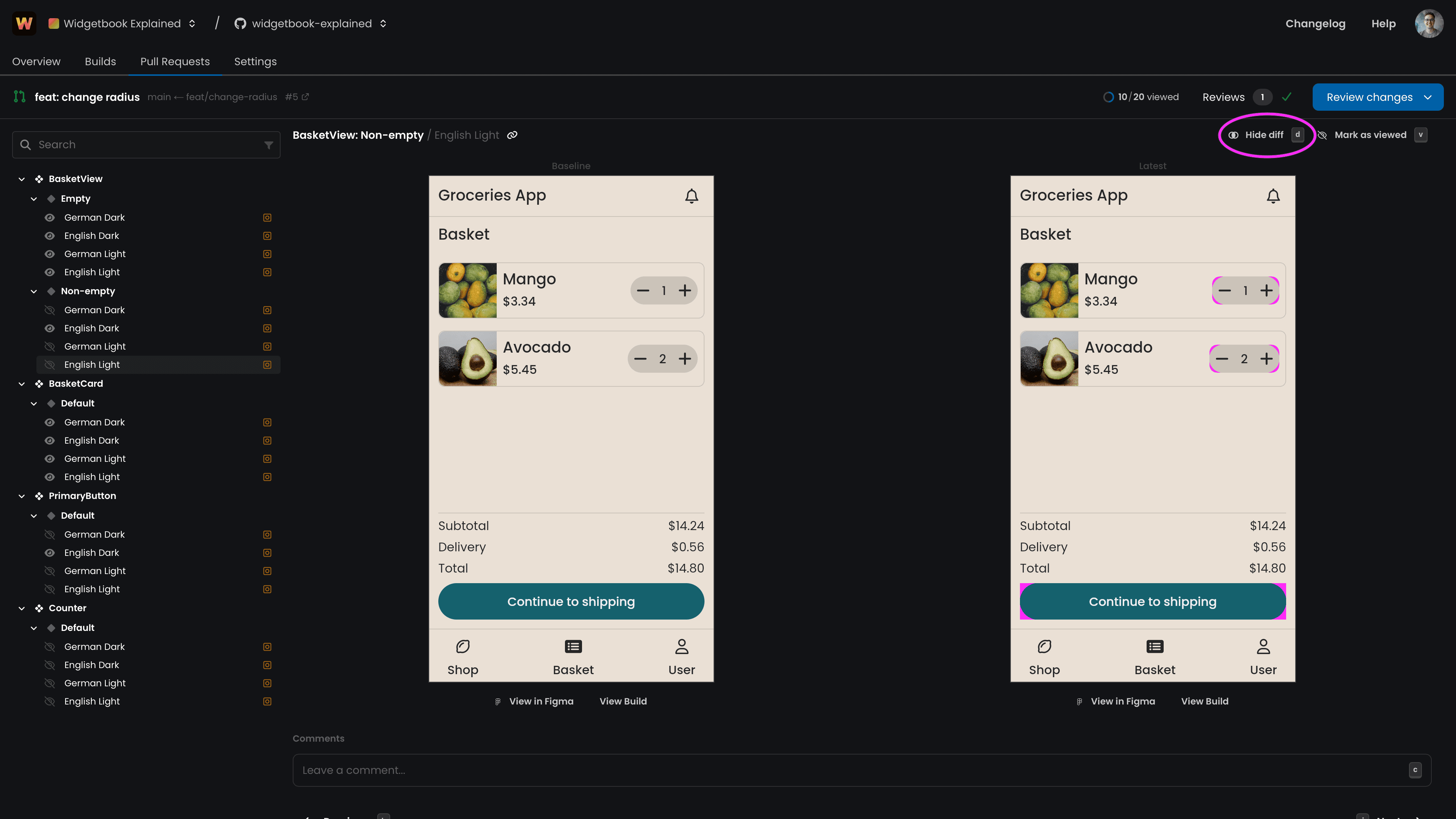
On every pull request, Widgetbook Cloud renders every scenario across every mode and diffs it against the base build. For UI review, the visual diff is the primary artifact, not the line diff in the Dart file.
1KOMMA5º gates merges on it. A detected visual change opens a pending GitHub status check that blocks the merge until the review is accepted. Since adopting it, they report shipping zero visual bugs, and 20% time saved across designers and developers.
Previously, our developers lacked visibility into whether they introduced visual bugs. While GitHub indicated which lines of code were modified, it did not provide the corresponding visual changes.
- Anton Borries, Senior Software Engineer at 1KOMMA5º, Google Developer Expert for Flutter and Dart
Salto measured their workflow at twice as fast. Their dark-mode keychain inconsistencies were found this way, pre-merge, rather than by QA on staging.
Widgetbook saves us a lot of time and provides valuable insight into which changes are made with each merge request. This prevents problems in the UI, and our workflow became certainly twice as fast.
- Arthur Schenk, Mobile Team Lead at Salto
Accessibility regressions

Widgetbook Cloud also captures the semantics tree for every scenario and diffs it against the base build, reporting each difference as Added, Removed, Changed, or Moved. A scenario joins the change set when the screenshot changed or the semantics tree changed, so a regression surfaces even when both screenshots are pixel-identical.
A diff does not need a rule. Detection reaches three WCAG criteria because someone had to write a check for each. Regression reaches every criterion you have already satisfied, because it does not need to know what a correct label or heading structure looks like. It only needs to notice the tree changed.
You label the accept button. Six weeks later someone refactors it and the label is dropped. The render is identical, so a visual diff sees nothing, but the semantics diff shows the label gone. The same holds when a refactor removes a Semantics wrapper, merges two nodes, drops a header flag, or reorders traversal.
Apps change, Flutter changes, and every change can quietly break accessibility. Widgetbook Cloud is how my clients keep the level they worked hard for.
- Manuela Sakura Rommel, Accessibility Consultant for Flutter apps
This is the honest division. Widgetbook Cloud will not get your app to AA. You do that manually, once. Widgetbook Cloud is what stops it from silently sliding back, which is how nearly all accessibility regressions ship. We go deeper in our accessibility testing guide.
Bring designers into the pull request
The workflow that makes this pay off:
A developer opens a pull request.
Widgetbook Cloud surfaces the visual and accessibility changes.
The author reviews and approves the intentional ones.
A peer reviewer confirms.
When the implementation deviates from Figma, the designer is pulled in at pull request level and reviews asynchronously, without running the app.
That last step is the one most teams do not have. Before it, 1KOMMA5º described the gap plainly:
As developers, we were not sure if we fully met the design requirements. Since designers were not involved in our review processes, it was hard to get their feedback. So, we had misalignment between design and code, and wrong implementations could be shipped to our customers.
- Anton Borries, Senior Software Engineer at 1KOMMA5º, Google Developer Expert for Flutter and Dart
Who owns what
Layer | Owner | Job |
|---|---|---|
Stories and tokens | Agent, reviewed by you | Read the design system before generating |
| Agent | Self-correct on assertions, overflow, and accessibility violations |
Widgetbook Cloud | Human | Judge visual and accessibility changes, approve |
Agents own coverage and correctness. Humans own judgment. The reviewer opens a pull request where tests pass, the render matches Figma, targets are large enough, and labels exist, and spends their attention on whether it is the right design.
Action plan
Build the token layer in Figma (or straight in code) with contrast and target sizes already correct. Decide primitive and semantic now, component tokens later.
Pick
ThemeExtensionor a customInheritedWidget, and put your design system in its own package.Build components against tokens. Enforce it with custom lint rules whose messages name the fix.
Catalog every component and every screen in Widgetbook 4, plus the token foundation itself.
Document each component with a doc comment on the widget class: when to use it, when to use something else, and the constraints the constructor cannot express.
Write a skill and point your agent at your story files.
Add a scenario per meaningful state and a
ScenarioConfigmatrix for themes, viewports, text scale factors, and locales. Runflutter test.Let the agent iterate all visual bugs are fixed, and create a PR.
Review all visual and accessibility changes on Widgetbook Cloud. Include a designer in the review if you are not sure if you met the design requirements.
Ship with confidence as you prevent visual bugs and align design and development.
Steps 1 to 5 are the design system. Steps 6 to 10 are what makes it hold up when the code is being written faster than anyone can read it.