Article
Building and Maintaining High-Quality Flutter UIs with a Custom Design System

Creating beautiful and maintainable high-quality UIs in Flutter goes far beyond writing good widgets. As your product matures past MVP stage and your team scales, consistent user experience becomes mission-critical. At this point, investing in a Design System isn’t optional — it’s the foundation of a robust and scalable UI architecture.
This guide will walk you through building and maintaining high-quality Flutter UIs by connecting your design workflow (Figma) with Flutter development and leveraging tools like Widgetbook, automated tests, and design reviews.
Who Is This Guide For?
This guide is written for product and engineering teams who are building one or multiple apps for an established business past the prototype stage. You are scaling your team, and now you need to:
Deliver a consistent and delightful user experience.
Onboard new designers and developers efficiently.
Reduce UI bugs and inconsistencies.
Scale UI development across teams and apps.
The solution: a Design System-first approach.
Start with the Design System in Figma
Your design system starts with your design team. Figma is the industry-standard tool for UI/UX collaboration, and it’s the best place to build and maintain your visual language.
🎓 Figma’s Free Design System Course walks designers through the foundations of creating a scalable and consistent design system.

Figma provides a free Design Systems course.
For those of you that don’t have the time to complete the full course (~2 hours), here the 3 key learnings:
Design systems are more than a UI Kit
A design system isn’t just components or styles — it includes processes, principles, governance, and documentation.Design Systems accelerate product development
A design system acts as a reusable resource of components, tokens, and guidelines that speed up design and implementation.
Teams spend less time reinventing patterns and more time solving product problems.Cross-disciplinary alignment is crucial
The course emphasizes early collaboration between product managers, designers, and engineers when building and evolving a system.
Decisions about tokens, component scope, naming, and versioning are not just design concerns — they impact dev workflows and roadmaps.
Design Handoff with Figma Dev Mode
Smooth handoff between designers and developers is key. Figma’s Dev Mode makes it easier than ever to translate designs into code.
📘 Design Handoff with Figma Dev Mode allows developers to inspect styles, measure spacing, and export assets seamlessly.

Screenshot from Figma Dev Mode’s tutorial video
Here are the three key learnings:
Centralized “Ready for Dev” handoff streamlines dev workflows
Figma offers aReady for Devview that collects every frame, component, or section marked as ready for development across a file. This creates a single source of truth for engineering teams—no more searching across the canvas or pages.
You can filter by status (ReadyorCompleted) and sort byactivity,page, orname—helping prioritize tasks and reduce confusion.
Image of Figma’s Ready for Dev view. Source
Real-time change tracking ensures accuracy and alignment:
The Dev Mode highlights which designs have “changed” since being marked ready and offers a Compare Changes feature. Engineers can inspect edits and visual diffs so nothing slips through the cracks.
This functionality reduces implementation errors, supports faster revisions, and helps developers catch updates immediately.Tighter design-to-code integration reduces friction:
Clicking a design in the Ready for Dev view opens it inFocus View, where full Dev Mode tools are available: inspect layers, view version history, and mark designs as completed.
TheFocus Viewsupports direct code snippet generation and integrates with tools like VS Code and Jira—bridging design and code, and boosting productivity.
Design-to-code with Figma's MCP server
The biggest shift in design handoff since this article was first published in August 2025 is Figma's MCP server, which turns Figma into a first-class context source for AI coding agents. Instead of feeding screenshots of designs to a chatbot and hoping it guesses your spacing, your colors, and your component structure, your agent can now read the actual Figma node tree, variables, and component metadata directly.
What the Figma MCP server actually does
The Figma MCP server exposes structured design data to any MCP-aware coding tool, like Claude Code, Codex, VS Code (with Copilot), Cursor and others. The most useful tools it provides:
get_design_context/get_code— returns a structured representation of the currently selected Figma frame (layers, layout, hierarchy, content). The agent uses this as the source of truth instead of a screenshot.get_variable_defs— extracts the variables and styles used in your selection (color, spacing, typography, radius). This is what lets the agent generate code that references your tokens instead of inlining hex values.Image and asset handling — the agent can pull SVGs, icons, and rasterized assets straight from the file.
There are two flavors of the server:
Remote MCP server (recommended) — hosted by Figma at
https://mcp.figma.com/mcp. No desktop app required. This is what most teams should use.Desktop MCP server — runs locally via the Figma desktop app at
http://127.0.0.1:3845/mcp. Useful for some enterprise setups.
Access is included with Dev or Full seats on paid plans. As of writing, it's in beta and free during the beta period.
The recommended workflow for Flutter teams with the Figma MCP
A workflow that works well for Flutter teams running Widgetbook:
Designer marks a component as Ready for Dev in Figma.
Developer selects the frame in the Figma desktop app (or pastes a Figma URL with a node ID).
Agent calls
get_design_contextandget_variable_defsto read the structure and the tokens.Agent generates the Flutter widget, resolving tokens through your
AppThemeand reusing existing components from your design system package.Agent generates the matching Widgetbook UseCases so the new component is immediately catalogued, testable, and reviewable.
Widgetbook Cloud picks up the new UseCase in the next pull request and runs visual regression tests against it automatically.
Steps 4 and 5 are the same conversation. The agent reads the design, writes the Flutter code, writes the v4 story file, and the Widgetbook generator turns that into something your team can review. More to that later in the article.
Building the Design System in Flutter
Organize Your Design System
To know how to best organize our design system, we need to understand the setup of our project.
Single App? Create a local design system package inside the repo.
Multiple Apps? Use a dedicated Flutter package repository and import it into each app via pubspec.yaml.
Monorepo? This is the preferred method of many Flutter teams. A monorepo structure — where multiple related apps and packages live in the same Git repository — can significantly streamline the management of a shared design system. In this setup, your design system can exist as a Flutter package within the same repository and be referenced using a relative path in each app’s pubspec.yaml. This offers several benefits:
Simplified versioning: Changes to the design system can be developed and tested across multiple apps at once, without publishing intermediate versions to a package registry.
Atomic changes: You can update the design system and consuming apps in a single commit, ensuring consistency and reducing integration issues.
Improved development velocity: Developers can work across apps and the design system without context switching between separate repos or dealing with dependency resolution delays.
Easier CI/CD integration: A unified pipeline can validate changes across all apps, ensuring that updates don’t break downstream consumers.
This makes monorepos a powerful choice for teams managing a suite of Flutter apps that rely on a common visual or component framework.
Create Your Style Foundation
Start by generating Flutter ThemeExtensions based on Figma Tokens.
Tokens are abstract, reusable values that define your design system. Depending on the complexity of your design system you may find a token hierarchy to support scalability across different sub-brands and components.
Tokens can be implemented using Variables or Styles. Prefer using Variables as they support a token hierarchy. Styles can still be useful for e.g. more complex gradients but those won’t be covered in this article.
Primitive tokens
Mature design systems have core primitive tokens like neutral/0 that represents a white #FFFFFF color . These primitive tokens are handled within their own variable collection in Figma. From a developer perspective you can see this as giving a specific hex color value an easier to remember name.
Semantic tokens
After defining the core primitive tokens the token system can be extended by adding semantic tokens giving more meaning to the use of a token for instance the primary color of a surface aka a background of a button or card.
Component-specific tokens
For more scalability within a design system, designers often define component-specific tokens as it provides more flexibility when changes across tokens are necessary and give them the freedom of refactoring the token structure without affecting all components.

Abstract token graphic from Figma’s guide about tokens, variables, and styles
Groceries App example
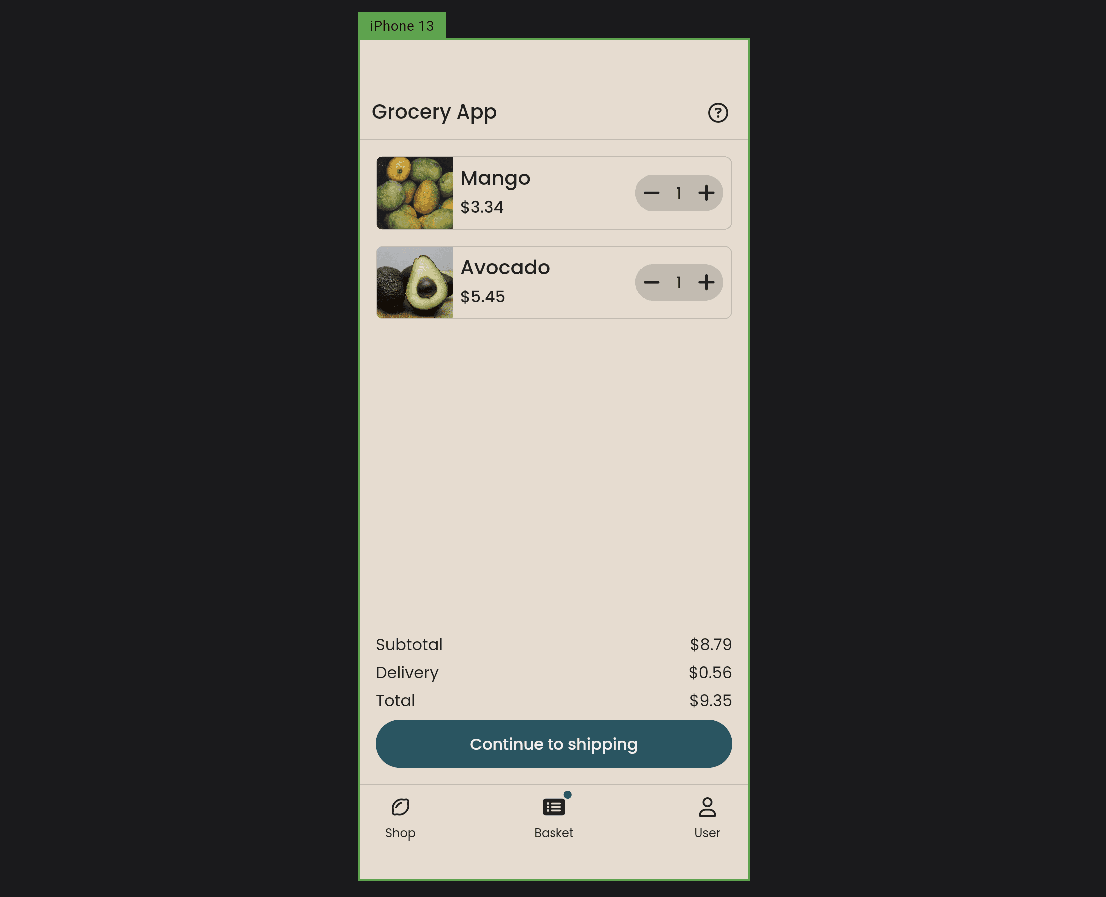
BasketScreen of the open-source Grocery App
For simplicity of the application and this article, the following example of a token system only uses primitive tokens and semantic tokens. The tokens include
Colors (e.g.
primary,background,onPrimary)Spacing (e.g.
space.xs,space.md,space.lg)Typography (e.g.
heading1,body2,caption)Radius (e.g.
none,sm,radius-full)

Token examples from Figma’s guide about tokens, variables, and styles
Let’s get started by generating Flutter class for the theme and it’s Radius tokens.
In this case, the DesignSystemRadius are the primary tokens defined as constant values.
From there we can continue implementing the other tokens until we finally can compare all of the tokens into a theme class.
Finally, we define an InheritedWidget to inject the AppThemeData into the Widget tree.
Use the AppTheme widget like this
and obtain the current theme by just using const theme = AppTheme.of(context) in any Widget.
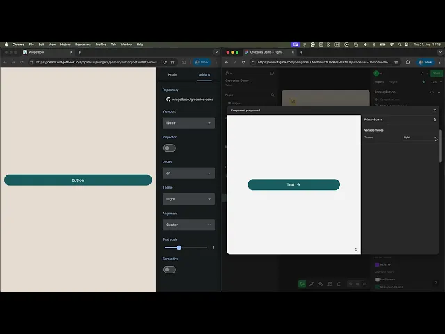
Build your own component library with Widgetbook

Screenshot of the Demo Widgetbook available on demo.widgetbook.io
Widgetbook is an open-source Flutter package used by developers to build, test, and organize their Flutter widgets. It helps professional Flutter teams to build and maintain their Flutter design systems.
Here is a 2-minute demo by Google:
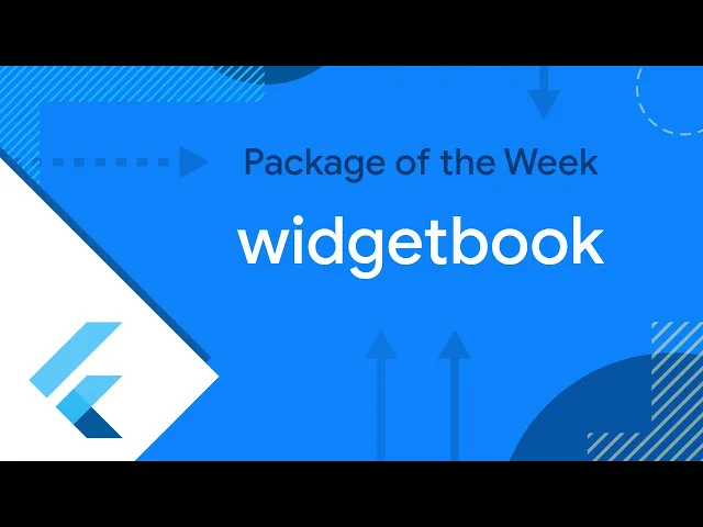
Google’s Flutter demo featured Widgetbook in the Package of the Week series
One example of a great custom Flutter design system is Zeta, which is built by Zebra Technologies. It is open-source. Below, you can see Zeta’s Widgetbook in action. You can also try it yourself.
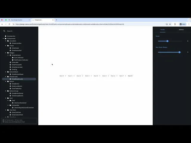
Widgetbook demo of the open-source design system Zeta
While Widgetbook is great for components, you can also catalog your Style Foundation in Widgetbook as shown in our open-source demo app.

Widgetbook Style Foundation

Widgetbook Style Foundation
Mirror Figma naming to Flutter
It helps to speak the same language with your designers. Widgetbook allows you to mirror Figma naming easily.
Widgetbook UseCases == Figma Variants
Figma uses variants to allow designers to design all different use-cases for the component. The equivalent to variants in Widgetbook are use-cases.

Widgetbook’s tree structure (left) vs. Figma’s tree structure (right)
ThemeData == Figma Variables
Figma’s variables allow designers to store reusable values that can be applied to various design properties — such as theming for colors or spacing. Developers can match that in Flutter with ThemeData.

ThemeData (left) vs. Figma Variables (right)
Widgetbook Addons == Figma Variable Modes
Figma’s variable modes allow designers to represent different contexts of our designs without needing to create multiple frames for every context that we need. Widgetbook’s addons allow developers to map all Figma variable modes, e.g. theme.
Widgetbook Addons (left) vs. Figma Variable Modes (right)
Figma Component Properties == Widgetbook Knobs
Figma’s component properties allow designers to communicate which parts of a component can be changed — such as text strings. Widgetbook’s equivalent are knobs.
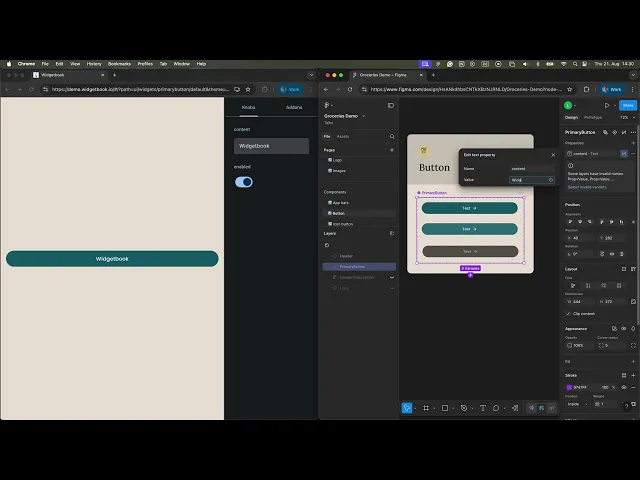
Widgetbook Knobs (left) vs. Figma Component Properties (right)
Component Architecture: From Atoms to Pages
Break your components down systematically. Most professional teams are following the Atomic Design Methodology. This structure makes your codebase easier to navigate and scale.
Atoms: Buttons, text fields, icons

PrimaryButton
Molecules: Counters, search bars, dropdowns

Counter consisting of multiple atoms
Organisms: Cards, list items, modals

Basket Card consisting of multiple molecules
Pages: Full screens with sections and edge-case states
Basket Screen consisting of multiple organisms
Document Everything
Documentation ensures reusability and clarity. You can include documentation in Widgetbook, like Zeta does. Or you can store higher-level guidance in tools like Notion, Supernova, or Zeroheight.

Zeta documents their design system in Widgetbook
Widgetbook: Not Just for Design Systems
While Widgetbook is perfect for your design system, extend its benefits to all widgets in your app, including pages. Widgetbook shouldn’t be limited to just design system-specific components — it’s equally valuable for app-specific widgets.
Including all your UI elements in Widgetbook helps ensure visual consistency, facilitates rapid development, and streamlines collaboration between designers and developers. App-specific widgets often incorporate unique business logic and custom states, making them prime candidates for visual testing and documentation. By rendering these widgets in isolation with different configurations, you can catch UI bugs early, validate designs, and create reusable test scenarios. This approach not only improves code quality but also scales well as your app grows, turning Widgetbook into a central hub for both shared and application-specific UI development.
Caza de Casa not only builds components but also every new page in Widgetbook. Their founder Mark even created a detailed, 20-minute demo video about their Widgetbook workflow. Check it out to learn how to save 1 hour a day with Widgetbook.
Video on how Caza de Casa saves 1-hour a day with Widgetbook
Sharing with Stakeholders
Other Stakeholders (QA, designers, PMs) should be able to see your widgets too. Options to host:
Host Widgetbook on your own infrastructure
For example, on an S3 bucket
If you host it yourself, you need to set up and maintain the hosting infrastructure yourself
Host on Widgetbook Cloud
Hosting is set up in 5 minutes
Paired with automated UI testing and structured design reviews
Free tier available

Widgetbook Cloud provides hosting, visual testing and a structured design review process
Automated UI Testing
Your users don’t care how clever your code is — they care how the app looks and behaves. Eventually, you will change and/or extend your design system. Developers need to ensure that design system changes do not accidentally break the app or lead to design flaws. Manually verifying every single change in all possible configurations is very cumbersome, time consuming and error-prone. That’s where UI Regression Tests, or Golden Tests come in.
However, Golden Tests have 4 issues (I even gave a talk about it. Here, you can see a YouTube Short):
We have to write them manually
Golden Tests are flaky because they differ for every operating system
Golden files (screenshots) clutter our repository because they are checked into Git
Reviewing Goldens is hard
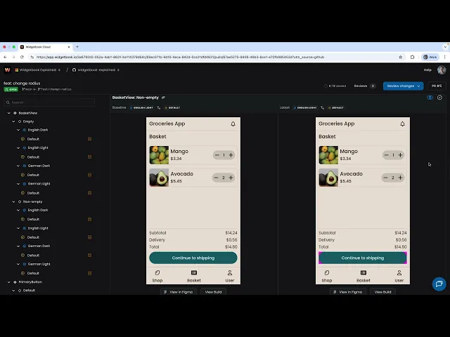
Widgetbook Cloud solves all Golden Test issues
No test writing required
Cross-platform compatible
UI changes are saved on Widgetbook Cloud where they can be easily accessed by everyone on the team
Structured review process that auto-detects visual changes in your pull requests and allows everyone on the team (including non-developers like designers or QA testers) to review UI changes
Design Reviews
Widgetbook Cloud provides Design Reviews — a structured, visual workflow that helps teams spot UI regressions and ensure fidelity between design and implementation. Design Reviews are mainly used by developers and designers.
Here is a 60-second demo video (turn on volume):
60-second demo of the structured review process of Widgetbook Cloud
👩💻 For Developers
1. Developer opens a Pull Request
Code and UI updates are pushed for review.
2. Widgetbook Cloud shows visual diffs
Widgetbook Cloud automatically catches all visual changes in the pull request. The changes are highlighted in the Review feature of Wigetbook Cloud.
3. Developer reviews & approves visual changes
The author validates intentional UI modifications.
4. Reviewing dev double-checks before merge
Peer reviewer confirms accuracy of visuals and code integrity.
👩🎨 For Designers
5. If needed, include the designer
When the implementation deviates from the Figma design and a designer should be consulted, you can now include the designer already on a PR level.
6. Designer reviews changes
Designers can review changes asynchronously without needing to run the app.
7. Precision feedback becomes possible, fast
No meetings. No guesswork. No misalignments.
Design Reviews enable product and engineering teams to shift left
“Shifting Left” refers to the practice of moving testing activities earlier (to the “left”) in the software development lifecycle.
In traditional development, UI testing often occurs late in the process, after much of the code is written. But shifting left encourages early testing, ideally beginning as soon as UI designs or components are being created.
Benefits of shifting left and surfacing visual issues during development:
Problems are fixed early
Feedback cycles shorten
Fewer design bugs reach production
Designer-developer collaboration improves
If you want your team to shift left, try Widgetbook Cloud for free.
Final Thoughts
A high-quality UI isn’t a one-time investment — it’s an evolving system built on collaboration, automation, and shared understanding.
Here’s your action plan:
Build a Design System in Figma
Sync it with Flutter using Widgetbook
Automate design handoffs, tests, and reviews
Share your system and keep it living
Your users will feel the difference. Your team will move faster. And your app will stand the test of time.


