


Getting Started with Widgetbook 3
Jul 19
10
min read
This article explains the open source Flutter package Widgetbook
This article explains the open source Flutter package widgetbook. It is the Storybook for Flutter, which helps developers cataloguing their widgets, testing them quickly on different devices and themes, and sharing them easily with designers and clients.
Every flutter developer coming from a web development background has probably heard and most likely even used Storybook.js before. It’s one of the most loved React packages, which speeds up UI development by allowing developers to build components in isolation. Developers can create stories, which represent specific use cases of a component. These stories can be catalogued. The resulting Storybook can be accessed by non-developers like designers or clients as well, which simplifies the review process. Since Flutter is based on widgets, we named our package Widgetbook.
Even though there are already some Flutter packages available trying to provide the values of Storybook.js, they lack certain usability and maintainability features. The code to set up and maintain the Storybooks of all existing packages has to be written manually, which is time consuming and cumbersome. The only exception is Framy but this package has not been maintained since October 2020 and is thus not null safe. Furthermore, the UI of all Storybooks is difficult to use. Therefore, we created Widgetbook. It comes with annotations which simplify setting up and maintaining it via code generation. Widgetbook is the only maintained Storybook package for Flutter with annotations. Since our team successfully raised funding, we are able to dedicate all of our time and resources in improving and maintaining our open source package Widgetbook.
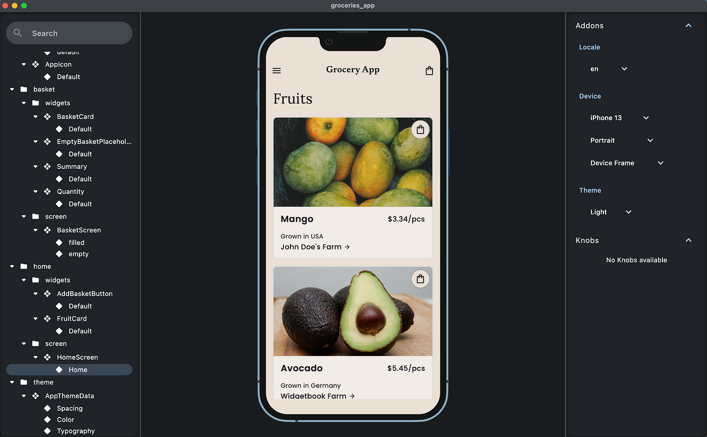
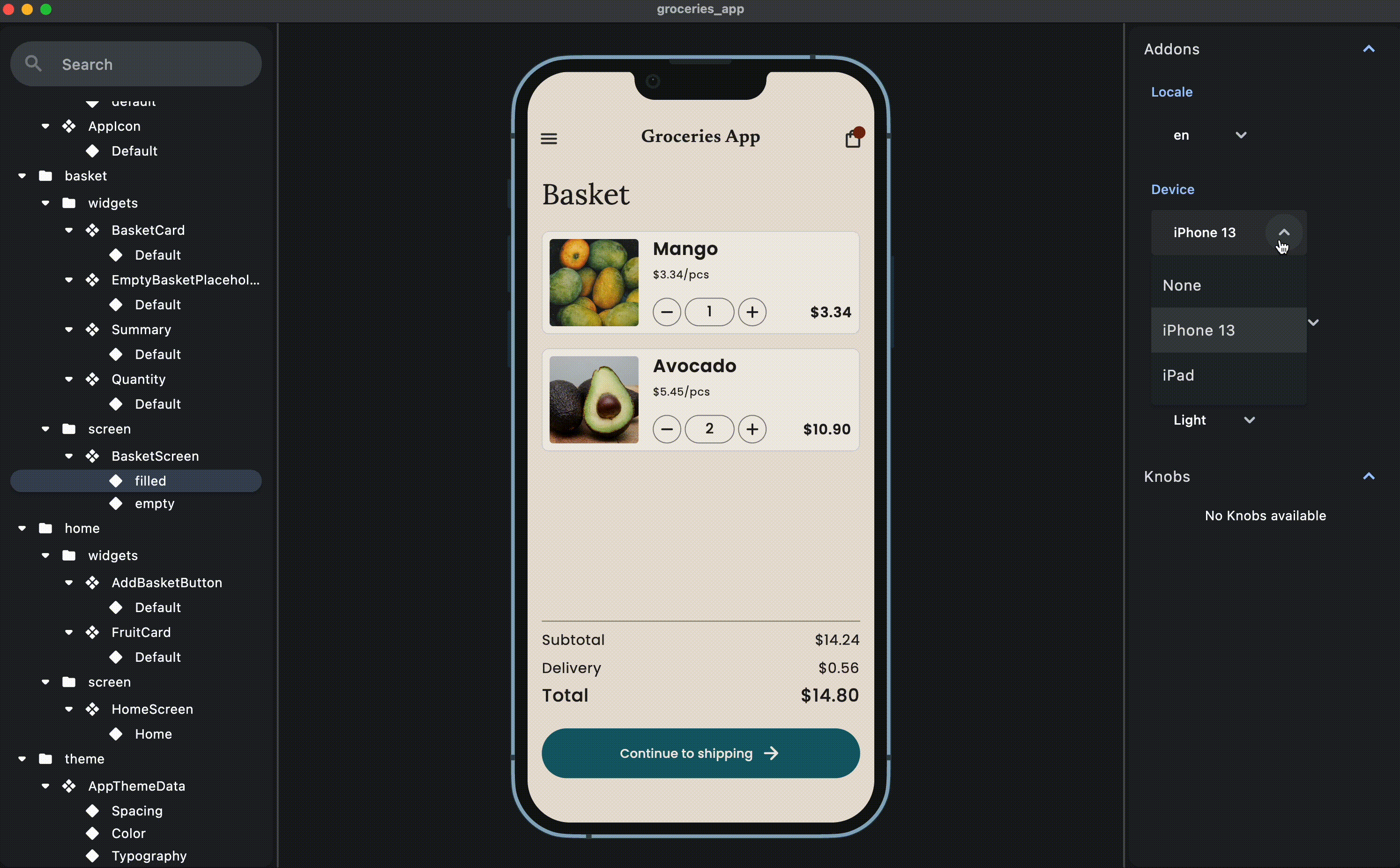
Widgetbook provides an environment to build UIs in isolation. It allows you to develop widgets without distractions from the surrounding screen and dependencies. In the UI of Widgetbook, you can quickly preview and test your widgets visually on different devices and themes. It allows you to spot UI flaws while developing that would be tedious to test on an emulator:
When your app grows and more and more developers are working on it, it becomes difficult to still keep track of all the widgets in your app. At this point, even the best naming conventions can not prevent developers from questioning, if some widgets have already been developed or not. Often these confusing structures lead to chaos and developers building identical widgets multiple times.
By using widgetbook, you can quickly preview all your widgets and screens, as well as their relevant use cases. Also, you can preview your styles, like spacing, colors or typography:

The review process in app development teams is often tedious and inefficient. When the developer finished developing a critical part of the app, it mostly needs to be reviewed by a designer, product owner or client. To receive feedback, the developer mostly has three options:
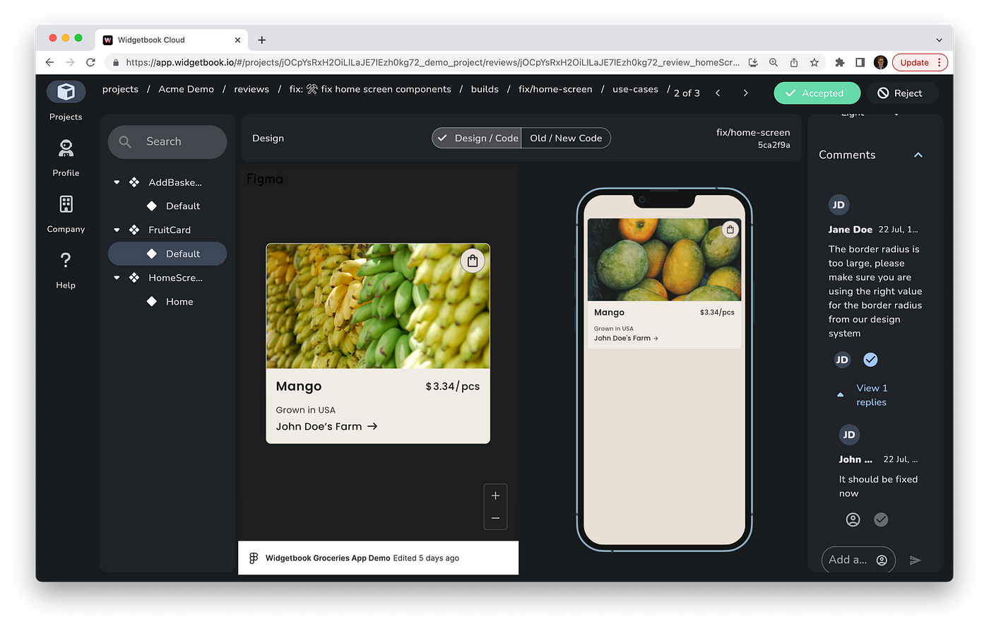
By using Widgetbook Cloud, your reviewers can easily access your Widgetbook via the web browser. Thereby, they can quickly review your widgets and screens on different devices and themes in comparison to their Figma designs. More information on Widgetbook Cloud is provided at the end of the article.
Before we delve into Widgetbook, it’s crucial to comprehend two approaches: The Manual Approach and The Code Generation Approach.
In the Manual Approach, widgets and their variants are individually added to the Widgetbook. While offering great flexibility, it can be tedious and prolonged, particularly with numerous widgets or intricate UIs.
Conversely, the Code Generation Approach, unveiled in Widgetbook 3, harnesses annotations to pinpoint widgets and their applications. An automatic catalog of all annotated widgets within your code is created with a code generator. This method is especially advantageous for extensive projects due to its time efficiency and reduced error margin.
This guide primarily highlights the Code Generation Approach, given its superior efficiency.
Now, let’s explore how Widgetbook 3 elevates your Flutter projects.
Get a head start with Widgetbook 3 by effortlessly integrating it into your Flutter projects.
Here’s a simplified guide using annotations for an efficient setup:
1. Installation:
Add the required packages to your pubspec.yaml:
2. Setting Up the Entry Point:
Create a new file, preferably named widgetbook.dart, within your lib directory:
The @App annotation signifies the WidgetbookApp class, which is derived from StatelessWidget. In the build method of WidgetbookApp, it yields an instance of Widgetbook.material. The directories variable, automatically generated by the @Appannotation is provided as an argument to Widgetbook.material, thereby configuring the essential directories for the Widgetbook application.
The structure of your app should look like
This basic setup allows for a catalog-style preview of your widgets, ensuring easy accessibility and reusability.
3. Annotate Your Widgets:
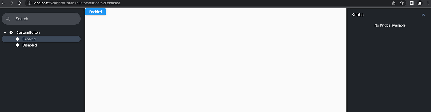
Widgetbook makes it easy to visualize different states or variants of a widget. For instance, consider a CustomButton:
The @UseCase annotation in Widgetbook pinpoints a widget’s specific scenario. This aids the Widgetbook tool in auto-generating the relevant code for that scenario.
For the @widgetbook.UseCase(name: ‘Enabled’, type: CustomButton):
These annotations aid Widgetbook in showcasing the specified use cases for your widgets.
4. Generate the Code:
Run the following command to initiate the code generator:
A file named widgetbook.directories.g.dart will be automatically created, eliminating the need for manual directory setup.
Your folder structure should now look like
Note that this file is imported to the entry point widgetbook.dart
5. Launch Widgetbook:
Widgetbook is designed to run seamlessly on Flutter Desktop and Web. To start the Widgetbook:
Switch out chrome for your platform (e.g., macos, linux, or windows). You’re all set to explore your widgets in the Widgetbook environment!
Harness the power of Widgetbook 3 and enhance your Flutter development process with organized and streamlined widget previews!
To learn more about Widgetbook 3, you can check the article Getting Started with Widgetbook 3 by our user Majid Hajian.
Currently, Widgetbook already allows developers to catalogue their widgets and test them quickly on different devices and themes. If you would like to share your Widgetbook with your design team or your clients, it is only somewhat feasible. You could run a web build and host it on your own server but that structure only supports working on one branch. Especially when working in bigger teams, multiple developers are working on different branches. Thus, the hosted Widgetbook should be shown in multiple versions. Also the open source Widgetbook does not come with any collaboration features.
But no worries, we got you! For this purpose, we’ve been building Widgetbook Cloud - a collaboration platform that hosts your Widgetbook on a web server supporting different branches and collaboration features to simplify and accelerate review processes. Widgetbook Cloud provides you with a structured review process to check your Flutter widgets in a side by side comparison with its design counterparts from Figma. Sign up for Early Access or check our website for more information.
For more information on Widgetbook, please visit our website and follow us on Twitter and LinkedIn. If you want to get in touch with us join our Discord, text us on Twitter or LinkedIn, or send me an e-mail. We love to get feedback from our users! 💙
Follow Flutter Community on Twitter: https://www.twitter.com/FlutterComm
